Client:
Café Olé
Country:
Mexico
Task:
Packaging Design
For Café Olé, we created special edition packaging designs that celebrate the richness of Mexican coffee culture while maintaining brand consistency across the cold RTD coffee line. These seasonal editions were developed to stand out from the regular lineup, yet stay true to the brand’s visual identity and the recent redesign of the full portfolio.
Each limited edition was crafted to clearly reflect the flavor it represents, through bold color palettes, unique illustrations, and storytelling elements that connect emotionally with consumers. The designs build on the success of previous special editions, reinforcing Café Olé’s commitment to visual creativity and product differentiation on shelf.
Imaginity | Design Agency | Branding, Packaging Design, Marketing
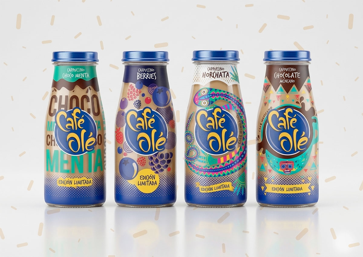
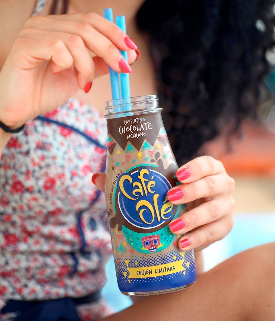
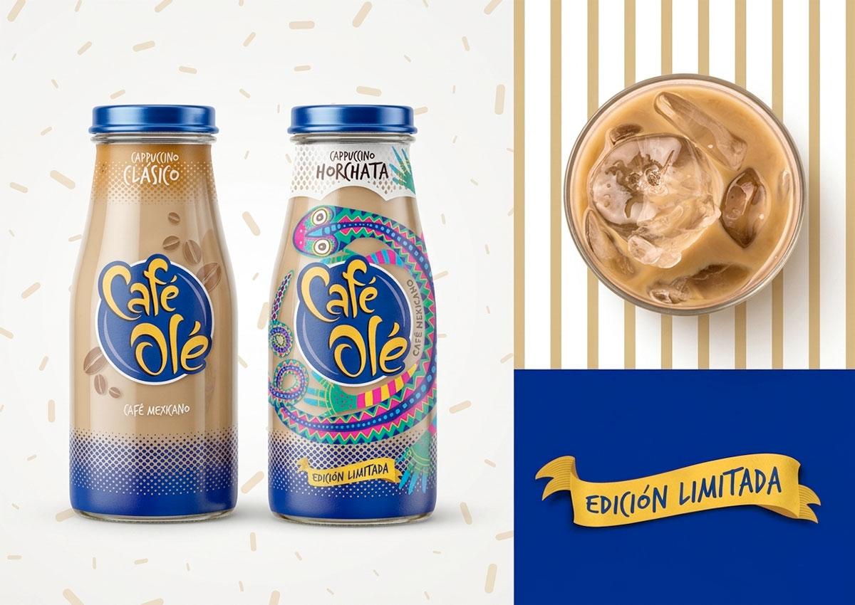
Two standout editions—Chocolate and Horchata—incorporate Mexican-inspired motifs, drawing on traditional iconography and folklore. The Chocolate edition uses vibrant, earthy tones and alebrije-inspired graphics to evoke richness, energy, and craft. Meanwhile, the Horchata design features lighter tones with delicate hand-drawn Mexican patterns, creating a refreshing and culturally rooted look that communicates authenticity and tradition.
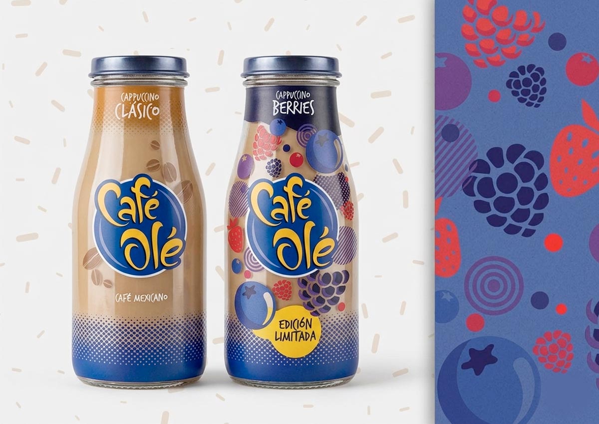
The Choco-Menta edition explores a bold, modern typographic approach, with dynamic letterforms and contrasting color fields that visually communicate the cool, indulgent character of the flavor. In contrast, the Red Berries edition bursts with color and vibrancy, using flavorful fruit illustrations to highlight freshness and natural appeal—capturing attention while staying aligned with the brand’s youthful, expressive tone.

