Client:
Wise Snacks
Country:
USA
Task:
Packaging Design
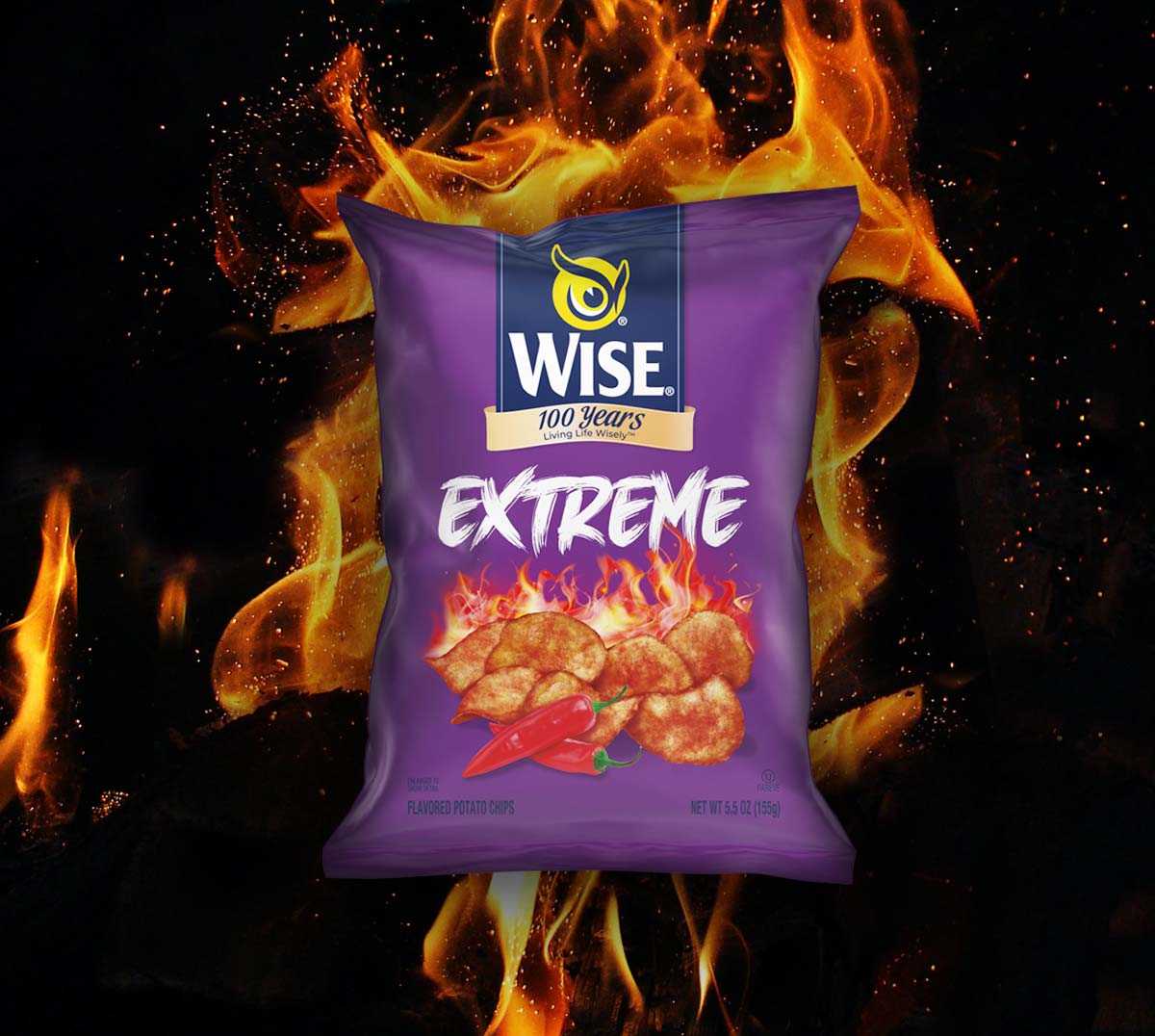
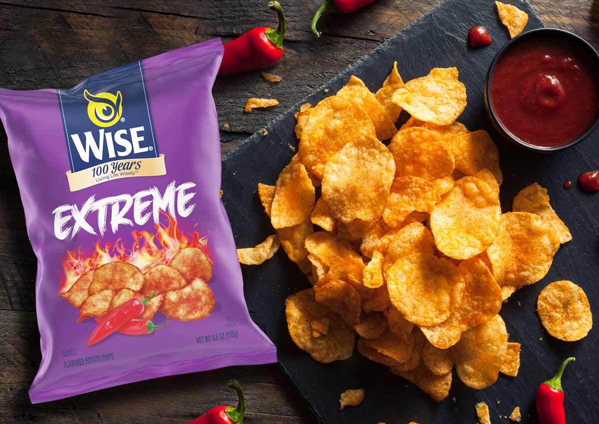
Working closely with our client, Wise Snacks, our design agency was tasked with the packaging design for their exciting new addition – Extreme Extra Hot Flavor. A new naming and packaging design that highlights the spiciness, intensity and strength of the flavor, with vibrant images and colors that communicate it visually.
Our creative vision aims to vividly showcase the boldness, and intensity of this flavor, infusing vibrant images and captivating colors that visually communicate its thrilling spiciness. We use vibrant images and striking colors to visually communicate its intense flavor.
Imaginity | Design Agency | Branding, Packaging Design, Marketing
The Challenge: Launching a Bold New Flavor
The main challenge was to create a new packaging design and naming for Wise Snacks' "Extreme” Extra Hot Flavor. The project needed to visually communicate the intense spiciness and strength of the new product, making it stand out as a bold addition to the brand's portfolio, particularly alongside other spicy flavors like the Roasted Green Pepper.
The Solution: Vibrant and Intense Visuals
We developed a design strategy that highlights the new flavor's intensity through vibrant images and striking colors. The creative vision was to use visuals to tell a story of boldness and spiciness, ensuring the packaging itself would convey the product's thrilling flavor profile. This approach provides a clear visual distinction while maintaining brand cohesion with other products.
The Results: Enhanced Flavor Communication
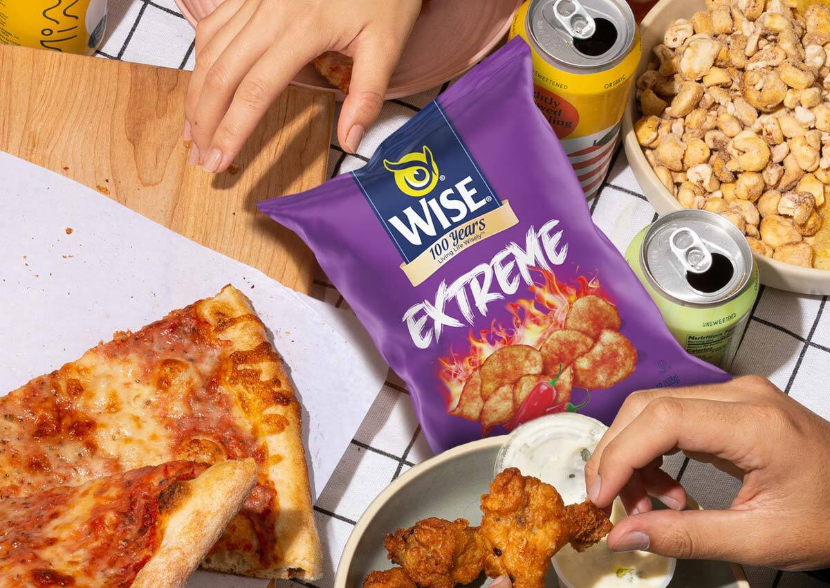
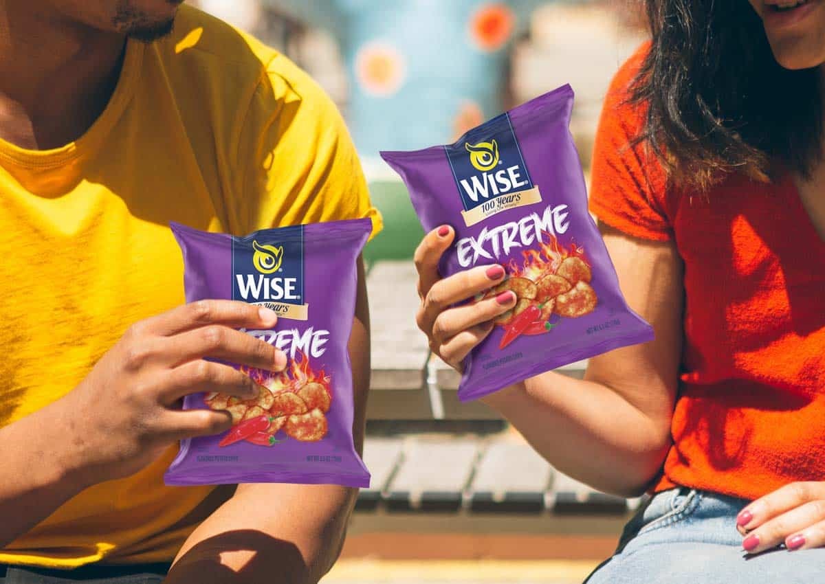
The project successfully delivered a visual identity and packaging design that vividly communicates the "Extreme Extra Hot" flavor. By using strong visuals and a distinct name, the product's spiciness is immediately apparent to consumers. This design not only positions the new flavor effectively within the brand's existing lineup but also grabs the attention of consumers seeking an intense and thrilling snacking experience.