Client:
Wise Chunky Salsa. Packaging Design
Country:
USA
Task:
Packaging Design, Branding
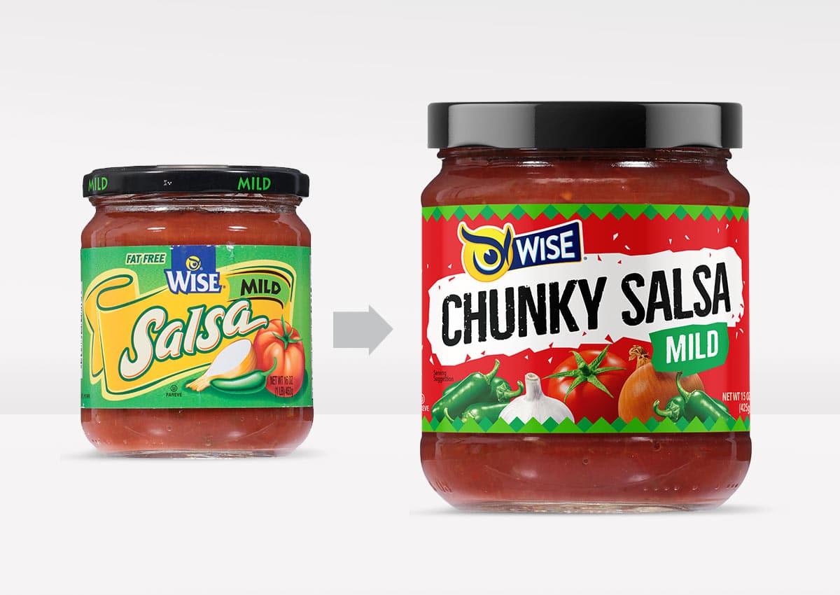
Elevating Flavor with a Bold New Look
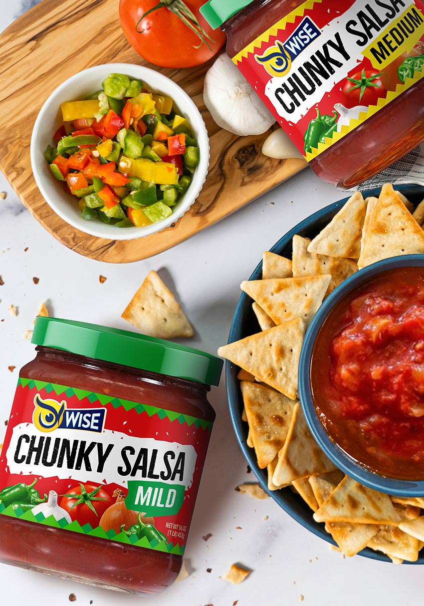
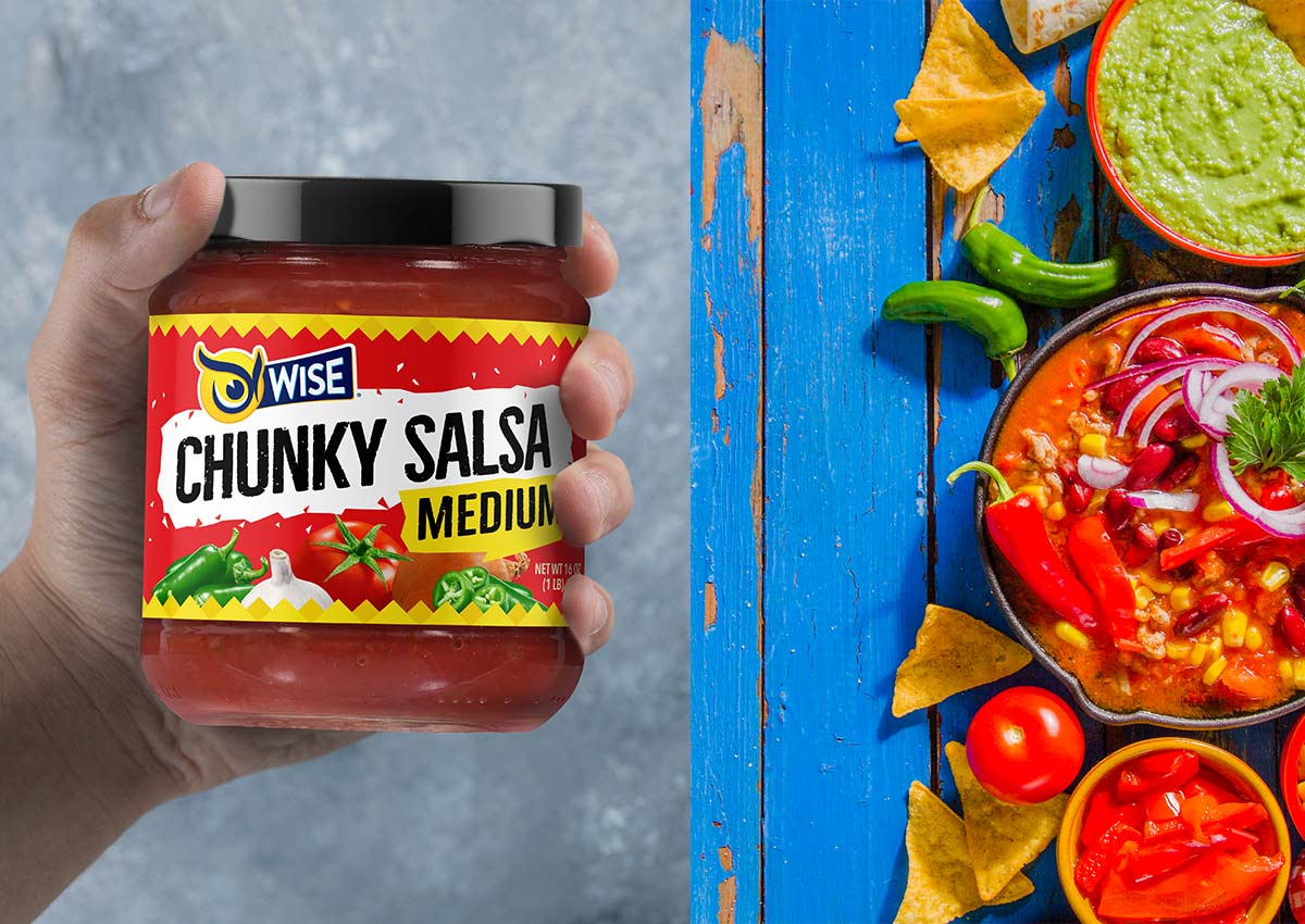
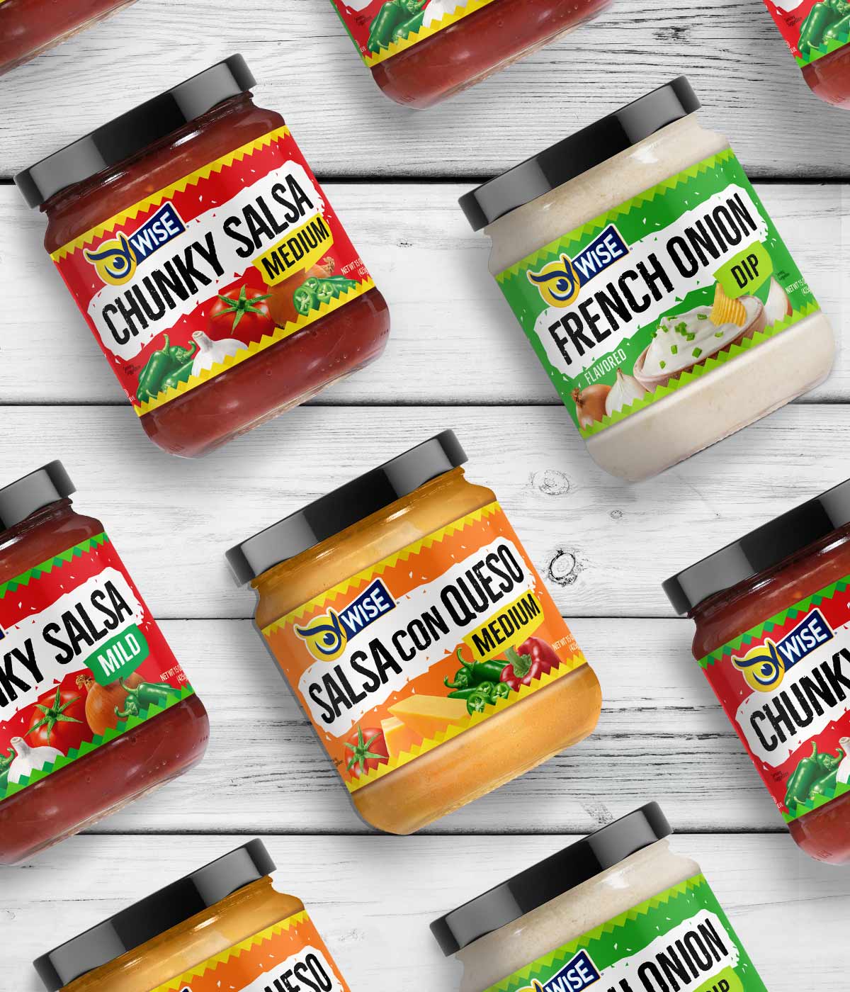
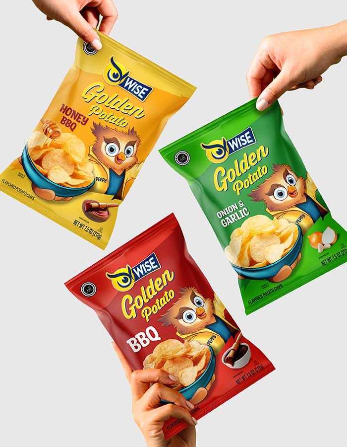
Wise Snacks continues to expand its dips portfolio with the launch of a new range: Chunky Salsas in Mild and Medium. As part of the project, Imaginity recommended renaming the line to “Chunky Salsas” to highlight the quality, authenticity, and hearty texture of the product. This new positioning reinforces taste and appetite appeal while setting a clear foundation for future flavor extensions.
Our task was to evolve the packaging design in the same direction as the recently refreshed Salsa con Queso and French Onion Dip, while giving the new salsas a distinctive identity within the growing dips portfolio.
Imaginity | Design Agency | Branding, Packaging Design, Marketing
A Unified but Distinctive Design System
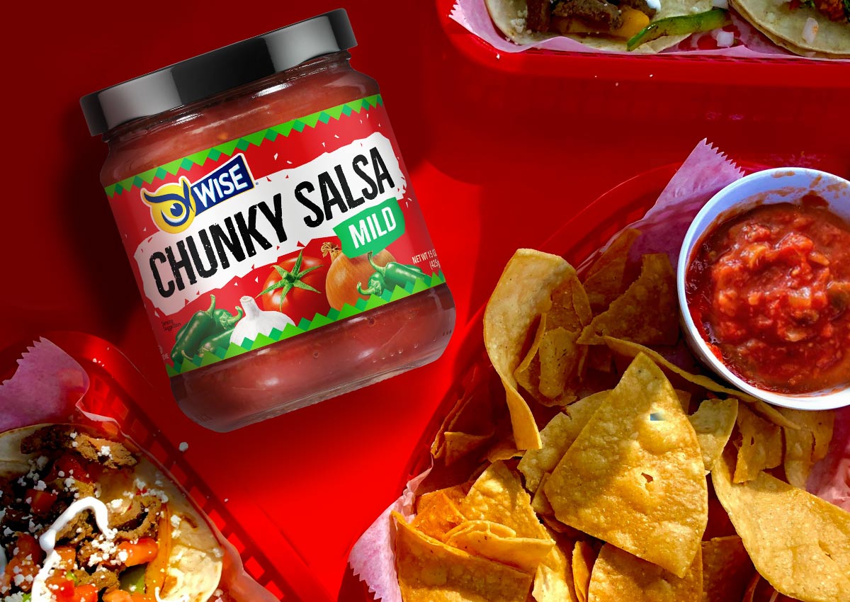
We developed a visual identity that balances brand consistency and flavor differentiation. The design highlights the chunky texture and vibrant ingredients with a dynamic layout and food photography that emphasize freshness and appetite appeal.
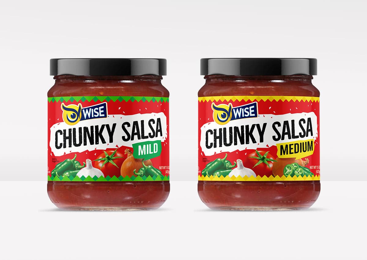
Color coding was used to clearly signal flavor intensity—green for Mild and yellow for Medium—making it easy for shoppers to navigate the range while reinforcing appetite cues. The Wise logo and product description anchor the design, unifying the dip and salsa portfolio while ensuring Chunky Salsas are instantly recognizable as part of the refreshed family.
Extending the Wise Snacks Experience
The new Chunky Salsas build on Wise’s tradition of delivering bold flavor experiences that pair perfectly with the brand’s iconic snacks. By aligning the salsas with the refreshed dip system, Wise reinforces its brand promise while ensuring each product stands out on shelf and delivers strong appetite appeal.
The result is a design system that elevates everyday snacking occasions while strengthening Wise’s position in the competitive dips category.
Balancing Tradition and Modern Appeal
We retained Wise’s signature brand identity, incorporating modern typography and design elements that enhance shelf impact. The layout was carefully structured to improve readability and clarity, making it easy for consumers to identify their favorite dips at a glance. The result? A visually enticing, flavor-forward packaging that invites consumers to indulge while reinforcing Wise’s reputation for delicious, high-quality snacks. This redesign ensures these beloved dips continue to stand out in an evolving market.