Client:
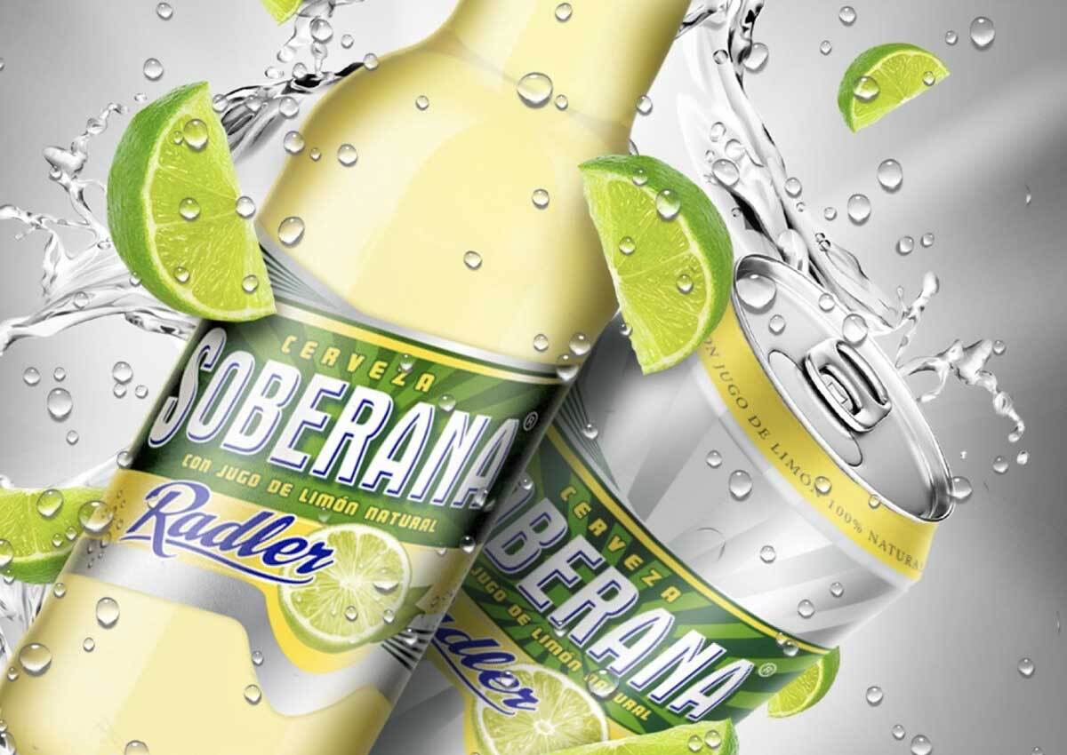
Soberana Radler, Barú Beer
Country:
Panamá
Task:
Packaging Design
Radler is one of Heineken Group most successful global volume innovations ever. It offers the refreshing fusion of lemonade combined with the great quality of beer. And it is being rolled out across the globe.
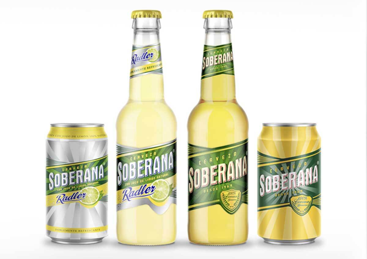
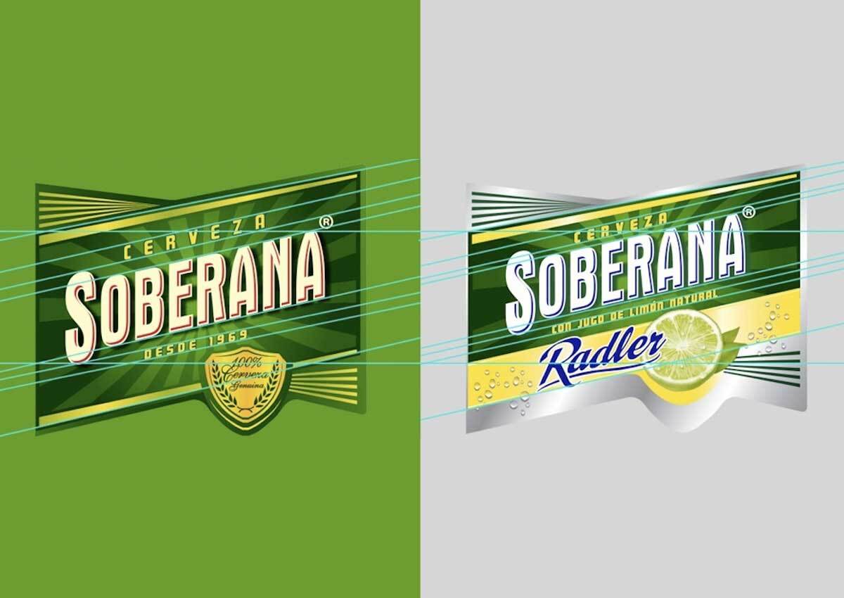
Soberana Radler, a new beer from Heineken in Panama, needed a package that, in addition to finding a harmony between the Soberana design and the characteristic graphics of Radler also communicated freshness and flavor through the concept of “double the freshness”.
For the packaging design, the inclusion of the sub-brand Radler and the lemons were images that helped us to communicate the product and its flavor in a clear and objective manner. For the coloring, we choose white and silver to enhance the concept of freshness and yellow to convey the lemon flavor. We kept the green Soberana present that the package was recognizable to the consumer.
Imaginity | Design Agency | Branding, Packaging Design, Marketing
