Client:
Ritz
Country:
Ecuador
Task:
Packaging Design
A classic that's been reinvented
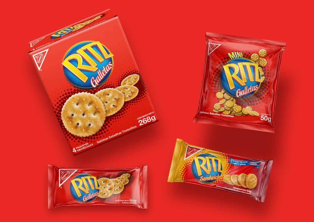
The Ritz Crackers packaging design project focused on giving the Ritz Crackers Line a new, fresh look. The challenge was keeping consistency within the line but also making it easy to differentiate each product from one another.
Kraft Foods Ecuador one of the biggest food companies in the country, with Ritz as one of their top brands contacted Imaginity as a packaging design agency for the project. A global snack food powerhouse with delicious products in over 170 countries, Kraft boasts an unrivaled portfolio of brands people love; including cookies, biscuits, confectionery, beverages, cheese, grocery products and convenient meals.
Imaginity | Design Agency | Branding, Packaging Design, Marketing
The Challenge
As one of Kraft Foods Ecuador’s most iconic brands, Ritz Crackers needed a visual evolution to modernize its presence in the market. The core challenge was to provide the entire line with a fresh, contemporary look while maintaining strict brand consistency. The goal was to balance the global power of the Ritz identity with a functional design that allowed consumers to easily differentiate between the various products within the portfolio.
The Solution
Leveraging Kraft Foods' position as a global leader in snacks, we developed a packaging system that honors the brand's heritage while improving shelf navigation. Our focus was on modernizing key design elements to give the line a more vibrant and up-to-date look. We implemented a clear system of visual cues to help shoppers distinguish between the different varieties, ensuring each product retains its identity without disrupting the familiar image. The design was crafted to reflect the quality and scale of a brand that competes in more than 170 countries, reinforcing Ritz's position as a leader in the cracker and snack category.
The Results
The redesign successfully delivered a cohesive and refreshed brand identity for Ritz Crackers in the Ecuadorian market. By streamlining the visual language, we minimized consumer confusion and improved the shopping experience across the entire line. The result is a harmonized product family that stands out in a competitive landscape, reinforcing brand loyalty and staying true to the high standards of the Kraft Foods portfolio.