Client:
Laboratorios Casasco
Country:
Argentina
Task:
Branding and Packaging Design
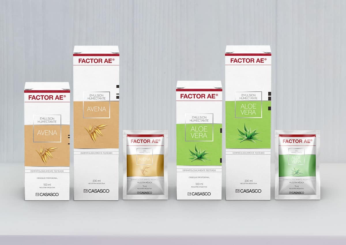
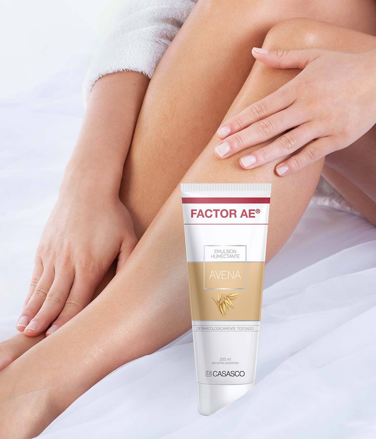
Pharma-Rooted Skincare: Balancing Clinical Heritage with Natural Aesthetics
When Laboratorios Casasco sought to launch "Factor AE," a new OTC skincare line inspired by its prestigious pharmaceutical heritage, they turned to Imaginity to develop a distinctive packaging strategy. Our task was to create a fresh visual identity for their range of Avena and Aloe Vera creams and emulsions. By bridging medical trust with cosmetic elegance, we developed a high-impact design solution that balances brand consistency with a modern, natural aesthetic tailored for the competitive skincare market.
Imaginity | Design Agency | Branding, Packaging Design, Marketing
Visual Highlights
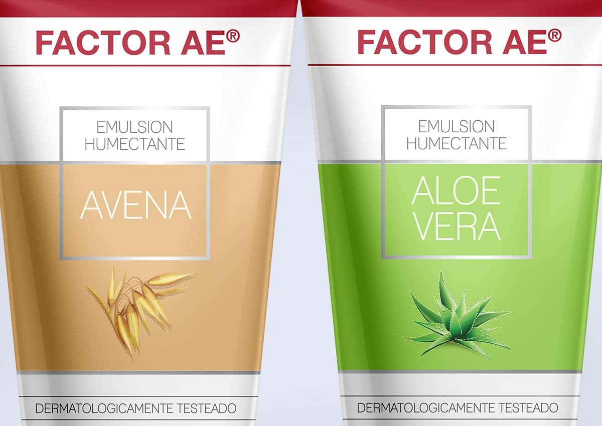
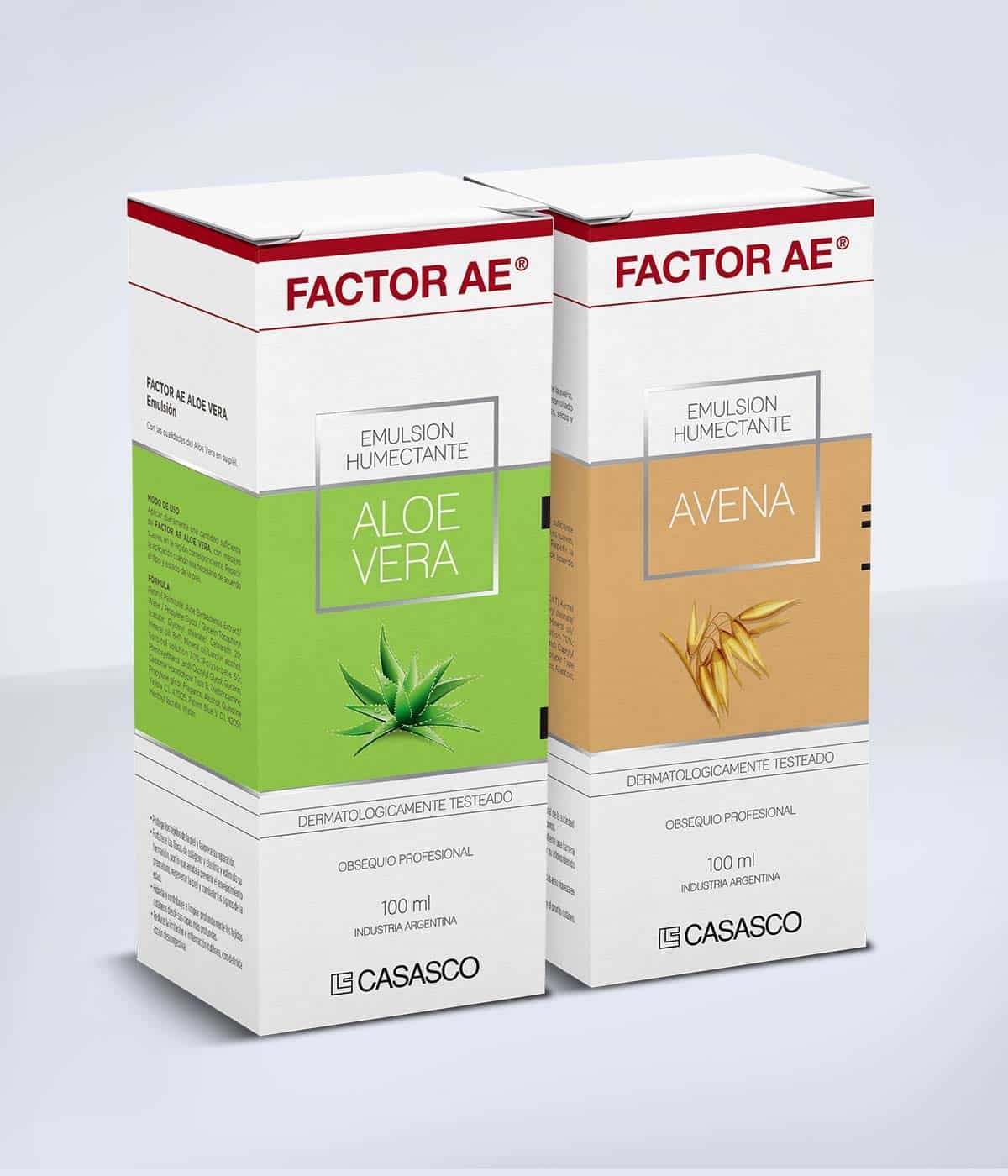
- Positive Logo Transformation: A refined, "positive" logo treatment designed to reduce visual weight and project a fresher, more approachable personality.
- Strategic Chromatic Coding: Vibrant, ingredient-driven color palettes that clearly differentiate the Avena and Aloe Vera varieties for intuitive consumer navigation.
- Premium Metallic Accents: Sophisticated silver detailing incorporated to elevate the brand’s perceived value and communicate a high-quality, premium positioning.
- Unified Visual Backdrop: A consistent, prominent brand zone engineered to adapt fluidly across various product formats and packaging sizes.
- Modern Minimalist Graphics: Clean, elegant design elements that effectively communicate the freshness and natural purity of the core ingredients.
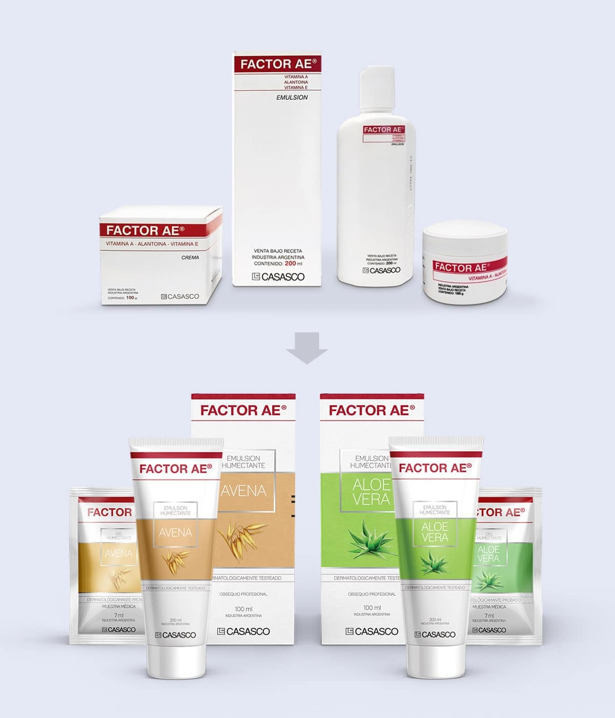
The Branding Challenge: Strategic Category Differentiation
The primary objective was to launch the Factor AE cosmetic line while clearly distinguishing it from Casasco’s existing prescription-only portfolio. The challenge lay in maintaining the "Factor AE" brand equity and medical reliability while shifting the visual language toward the "Natural/Daily Care" category. We had to create a design that felt lighter and more energetic, ensuring the new OTC line could compete effectively on retail shelves without losing the professional backing of its pharmaceutical roots.
Our Design Process: Branding Evolution and Visual Strategy
Beginning with a deep dive into the brand’s existing identity, we focused on the transition from "Rx" to "OTC." Our team strategically worked on a "positive" logo pass to achieve a more renewed image. We then developed a comprehensive graphic system centered on a dedicated visual area that serves as a brand anchor. This phase involved testing color saturations and typographic hierarchy to ensure the packaging communicated hydration and natural care at a glance, resulting in a cohesive identity that feels both innovative and trustworthy.
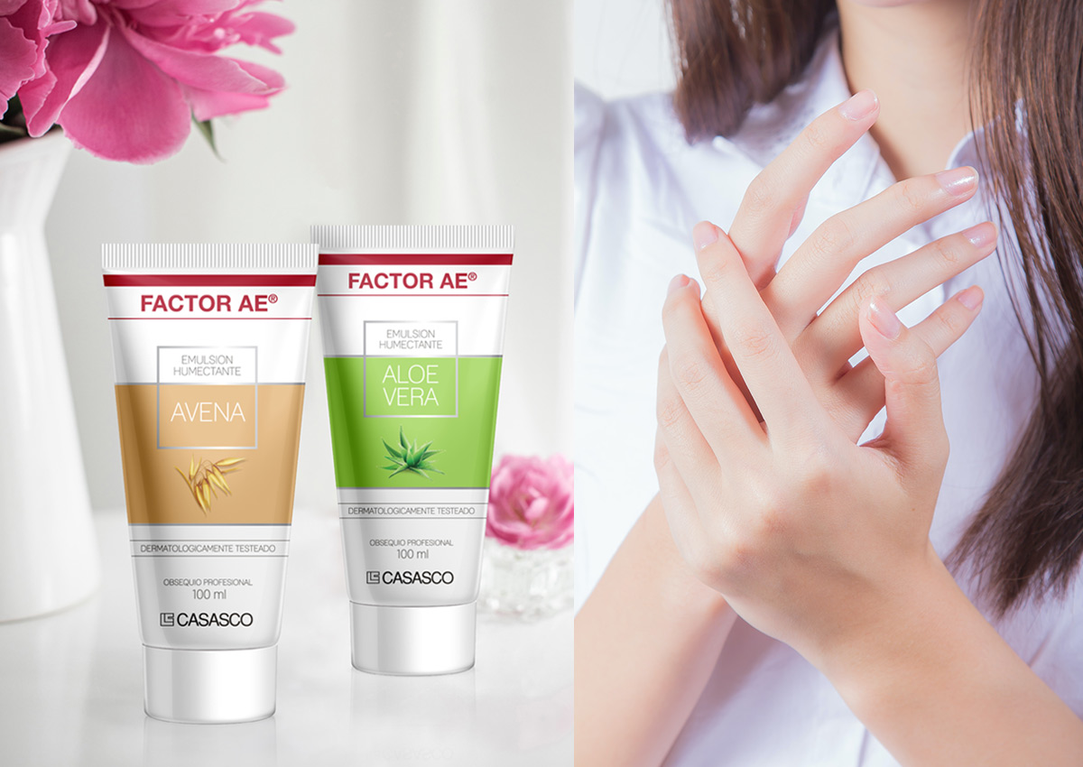
The Outcome: A Stronger Emotional Connection and Market Presence
The project resulted in a successful market entry that clearly separates the Factor AE cosmetic range from the rest of the pharmaceutical offer. The new packaging achieved significant shelf impact and strengthened the brand's emotional connection with consumers seeking professional-grade skincare. By delivering a clear, modern, and strategic design, Imaginity ensured that Factor AE not only stands out at the point of sale but also solidifies its position as a premium leader in the Argentine dermo-cosmetic market.
This packaging design project for Factor AE demonstrates Imaginity’s ability to navigate the intersection of health and beauty. Consistent with our work in strategic branding and visual identity, we have created a design system that acts as a powerful vehicle for brand growth, ensuring a seamless and successful transition into a new consumer category.
Imaginity is a branding and packaging design agency specializing in skincare, personal care, and OTC brands. We work with pharma & cosmetics companies to develop cohesive packaging design systems and visual identities that communicate product benefits, enhance shelf navigation, and support scalable product lines across retail and pharmacy environments.