Client:
Bagó. Dioxaflex
Country:
Argentina
Task:
Packaging Design
A new OTC pack
Imaginity | Design Agency | Branding, Packaging Design, Marketing
The challenge
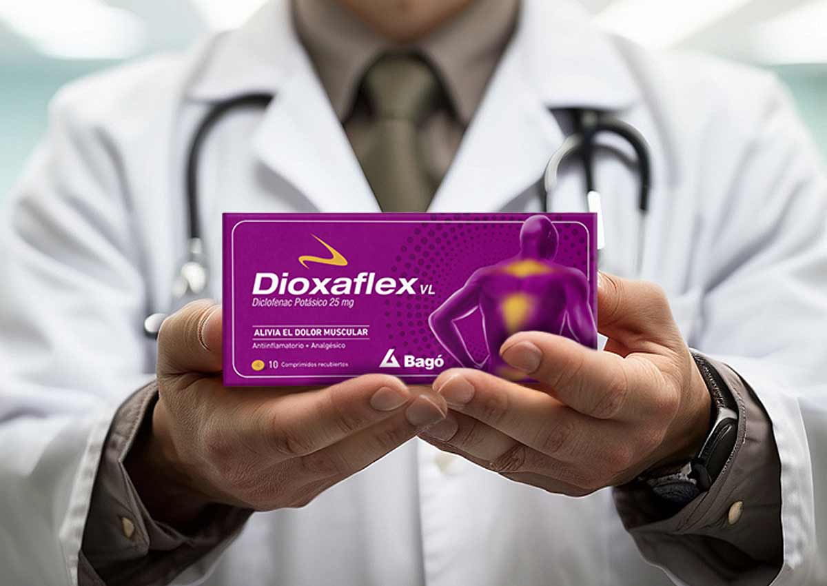
Staying within the brand's universe, while adding visual impact. Design the packaging version of Dioxaflex within the world of over-the-counter medicines. Combining the recognition of the already known prescription product among consumers and the codes of the over-the-counter category (more visual impact, colors, elements).
The solution
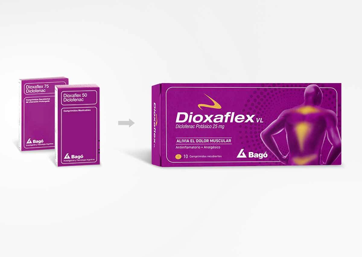
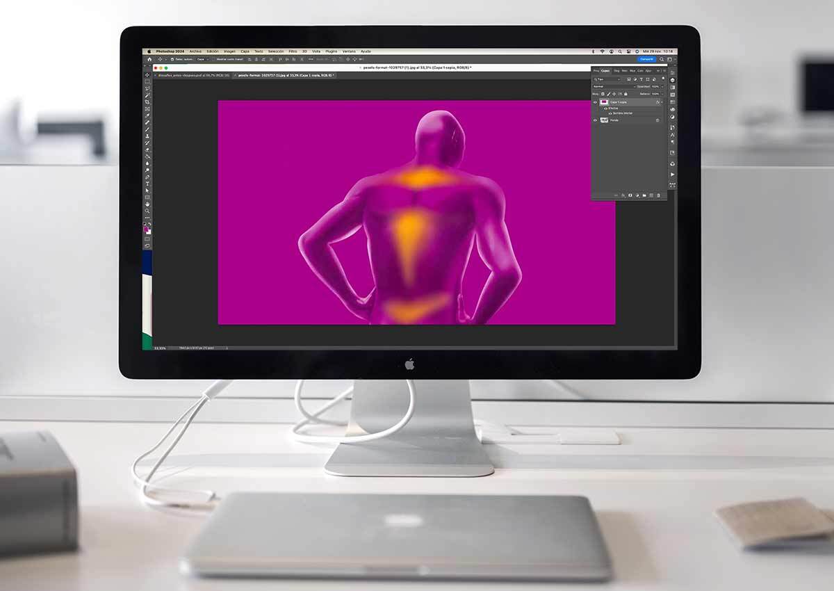
To add the appeal it needs in the highly competitive over-the-counter market, we incorporated a human figure highlighting the areas of pain, along with a subtle pattern detail in the background to add depth and visual interest. To maintain product recognition, we decided to incorporate into the design the brand’s signature outlined rectangle, along with its distinctive color used across the product line.
The results
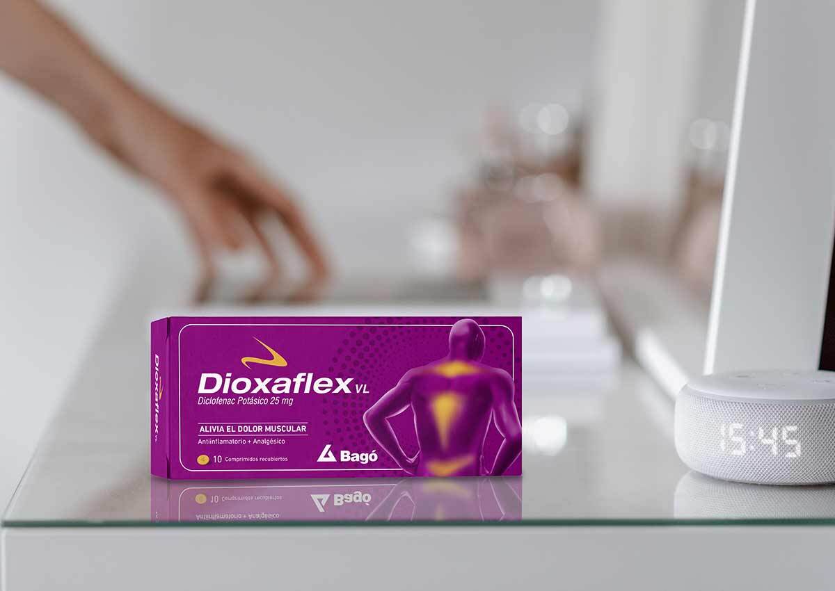
A new packaging design for over-the-counter Dioxaflex that successfully positions the product within the OTC medication category while preserving its strong recognition and trust among consumers.
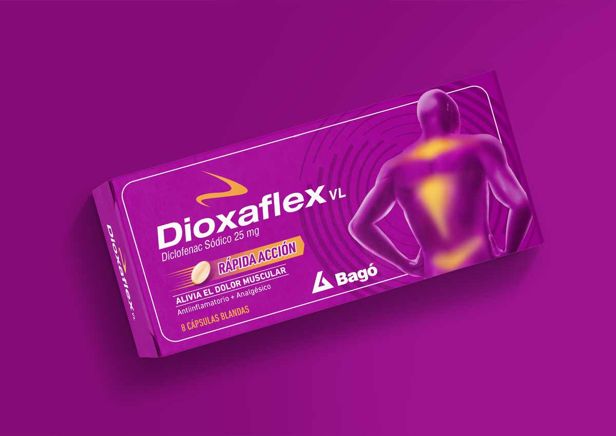
Fast-acting relief
We also worked on the design of the fast-acting version, creating a clear visual coding that differentiates this product from the tablet version while maintaining strong recognition across the product line.

Imaginity is a global branding and packaging design agency specializing in OTC and healthcare brands. We develop integrated communication systems that connect packaging, in-store visibility, and brand messaging to drive product awareness and conversion.