Mercado Libre - Branding a Leading Digital Ecosystem
How Imaginity designed a cohesive brand system for Mercado Libre
Mercado Libre Brand Evolution
Mercado Libre is the leading e-commerce and fintech company in Latin America, and its brand identity is built on the principles of trust, accessibility, and innovation. The brand is synonymous with convenience and efficiency, offering a user-friendly platform that connects millions of consumers and businesses across the region.
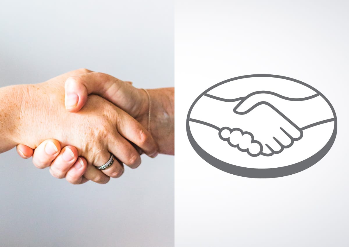
The visual identity of Mercado Libre reflects these values, with its iconic logo featuring two hands shaking, symbolizing trust, partnership, and community. This emblem reinforces the idea that Mercado Libre is more than just an online marketplace; it’s a platform that fosters connections between buyers and sellers, empowering them to engage in safe and successful transactions.
1. Strategic Brand Architecture
-
Audit & Brand Consulting: Conducted a comprehensive analysis of the existing global brands ecosystem to identify points of visual friction.
-
Ecosystem Unification: Developed a structured hierarchy to align Mercado Libre, Mercado Pago, and other brands under a single, cohesive branding strategy.
-
Sub-brand Integration: Designed a modular system that allows sub-brands to function in perfect harmony while maintaining their specific market relevance.
2. Design Process & Visual Identity
-
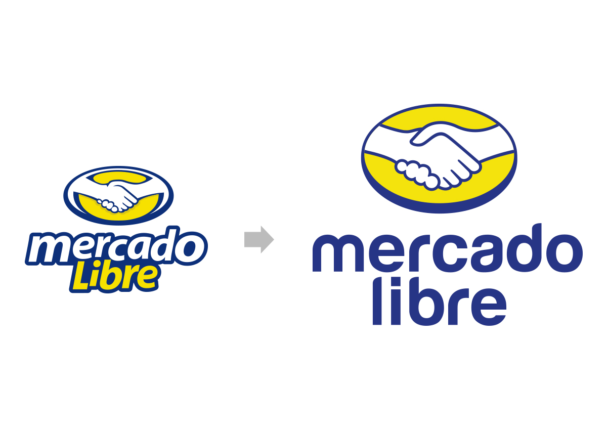
Logo Simplification: Transitioned from a detail-heavy, outdated "handshake" to a minimalist, iconic isologotype.
-
Typography Overhaul: Implemented a modern, custom sans-serif typeface to improve digital legibility and brand friendliness.
-
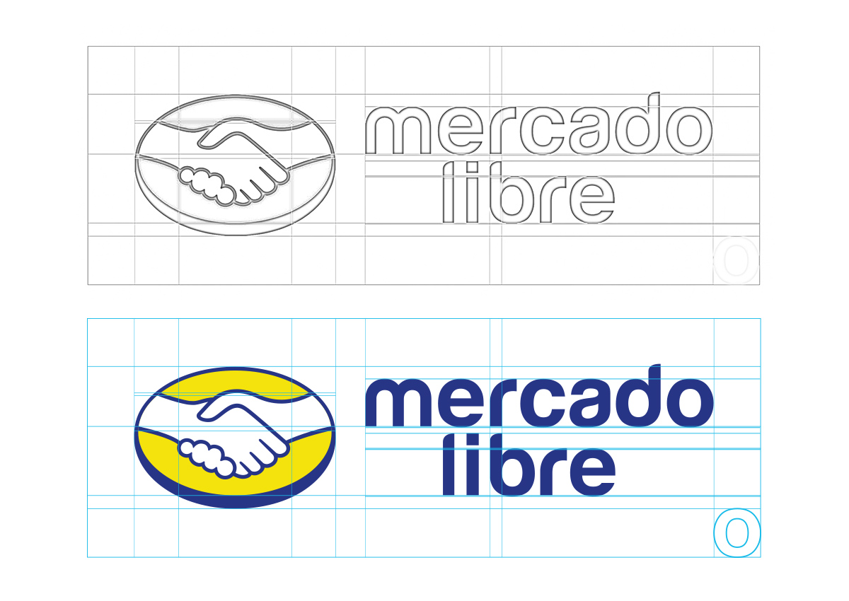
Grid Optimization: Engineered a precise geometric grid to ensure technical consistency across all design applications, from small-scale icons to large-scale logistics.
-
Digital-First Engineering: Reduced visual complexity to enhance performance and recognition within digital instore marketing and mobile UI/UX.
3. Technical Milestones & Deliverables
-
Brief Alignment: Successfully translated the initial brief into a scalable visual system that honors the brand's heritage while embracing e-commerce innovation.
-
Implementation Variations: Created vertical and horizontal lockups to ensure versatility across various media formats.
-
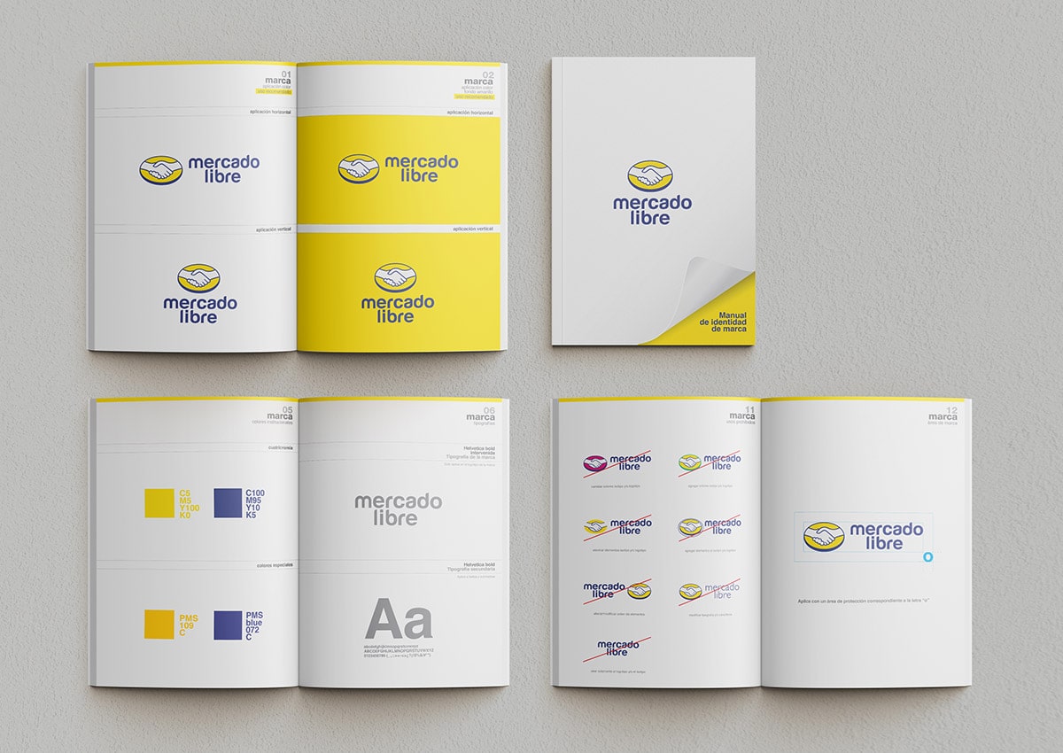
Comprehensive Brand Manual: Developed an exhaustive technical guide covering color theory, clear space, and prohibited uses to safeguard the visual identity across Latin America.
-
Global Experience Validation: Leveraged Imaginity's global experience to deliver a result that balances corporate reliability with a modern, vibrant user experience.
Earlier Mercado Libre Logo
The old Mercado Libre logo prominently featured a more detailed version of the iconic handshake symbol, with heavier lines and a traditional look. It was symbolic of trust between buyers and sellers, but it felt outdated and lacked modern appeal. The handshake was encased in a globe, representing Mercado Libre’s mission as a broad-reaching platform. However, the logo was visually complex and did not easily translate across digital and mobile applications, which became increasingly important as the company grew.
Previously Disconnected Brand Architecture
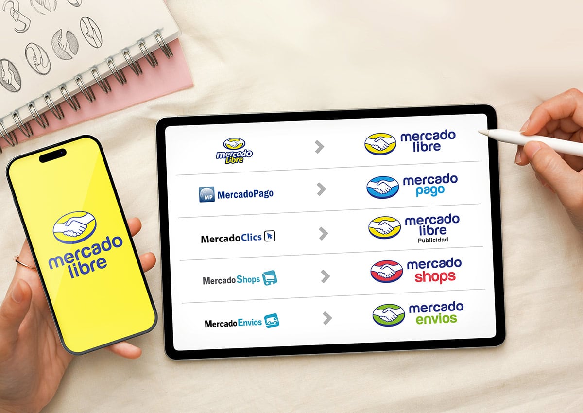
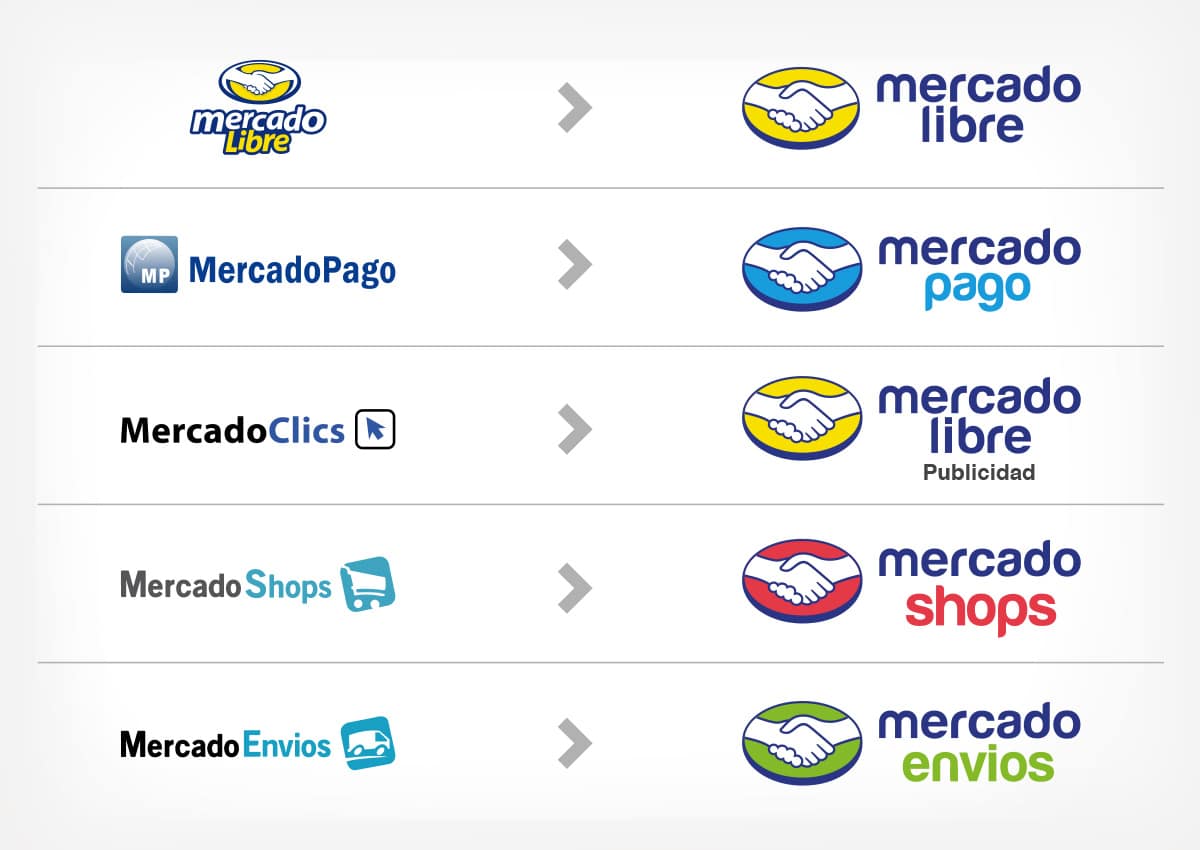
In its earlier years, Mercado Libre and its ecosystem of sub-brands operated with a disconnected brand architecture, where each service—Mercado Pago, Mercado Envoys, Mercado Shops, and others—had its own distinct visual identity. These individual brands featured separate logos, color schemes, and design elements, resulting in a fragmented user experience.
This disjointed branding caused confusion among users, as there was no clear visual connection between the parent brand and its sub-brands. The lack of a cohesive brand identity led to inconsistent user experiences, particularly for consumers navigating multiple services within the ecosystem. Without a unified design language, each service felt like an independent entity rather than part of a larger, integrated system, which diluted the overall brand equity of Mercado Libre.
This outdated approach to brand architecture created brand silos, where individual services did not benefit from the collective strength of the Mercado Libre brand. As Mercado Libre expanded across Latin America and became a household name, the need for a more streamlined, cohesive brand identity became apparent to strengthen its position as a leader in e-commerce and digital services.
New Brand Architecture
In its earlier years, at Imaginity, we collaborated with Mercado Libre to tackle the challenges of a fragmented brand architecture by adopting a more unified structure, where all sub-brands share consistent design elements that strengthen the parent brand. This approach allows for greater recognition and trust across all services.
The new brand architecture for Mercado Libre was planned in a structured, strong, and competitive manner, enhancing each sub-brand while maintaining cohesion. We achieved this by creating a solid and recognizable brand system that reinforced unity within the group. Our focus was on unifying the design criteria of the sub-brands, enabling quick identification through a more efficient system and leveraging the quality and recognition of the parent brand.
Mercado Libre now operates a more cohesive brand architecture, where all sub-brands align with the parent brand's design language, fostering recognition and trust across e-commerce, fintech, logistics, and digital services. The brand's ecosystem evolved into a house of brands, where each sub-brand plays a vital role while maintaining a unified identity under the Mercado Libre umbrella.
Ultimately, Mercado Libre's brand identity is anchored in its mission to democratize commerce and finance in Latin America, blending innovation and reliability to provide a seamless, trusted experience for its users across diverse markets.
Mercado Libre Brand Identity

The parent brand, Mercado Libre, is the central marketplace platform for Latin America, connecting millions of buyers and sellers across the region. It is the core brand that integrates all other services, offering a user-friendly interface and reliable transaction platform. Its visual identity, particularly the yellow and blue color scheme and handshake logo, sets the tone for the entire ecosystem, symbolizing trust, connection, and accessibility.
Mercado Pago Brand Identity
Mercado Pago is the fintech arm of the ecosystem, providing secure, convenient, and flexible payment solutions. Originally created to facilitate payments within Mercado Libre, it has since expanded to offer digital wallets, online payments, and credit services beyond the marketplace. Its identity is closely tied to Mercado Libre, but it has distinct positioning in fintech, offering an array of tools for both consumers and businesses to manage their finances.
Mercado Envíos Brand Identity
Mercado Envíos is the logistics and shipping brand within the ecosystem, responsible for handling the delivery and fulfillment of products sold on Mercado Libre. It offers solutions like same-day delivery, tracking services, and reliable shipping across Latin America. The brand focuses on making the entire shipping process as seamless as possible for both sellers and buyers, ensuring customer satisfaction and supporting Mercado Libre's commitment to convenience.
Mercado Shops Brand Identity
Mercado Shops provides e-commerce solutions for businesses wanting to create and manage their own online stores. It enables sellers to build standalone digital storefronts while still benefiting from Mercado Libre’s robust infrastructure, including payment, shipping, and customer service tools. This brand allows businesses to customize their branding and digital presence while leveraging Mercado Libre’s network and technological capabilities.
Brand Manual
To ensure the proper application of Mercado Libre's new identity, we developed a brand and usage manual containing all the essential information about the brand, including size applications, minimum size reductions, typography, color palette, safe areas, applications on various backgrounds, prohibited uses, and more. This brand manual serves as a comprehensive guide to guarantee consistency in its implementation, preserving the brand’s fresh, relaxed, and always up-to-date essence.
Brand Cohesion And Identity
Though each of these sub-brands has its unique positioning and function, they all operate under the unified identity of Mercado Libre. The ecosystem’s branding ensures that the experience feels seamless across services, with consistent use of color schemes, visual elements, and user-friendly interfaces that promote trust, ease of use, and reliability.
Together, Mercado Libre’s ecosystem of brands provides a comprehensive set of tools that cater to the diverse needs of consumers and businesses, from purchasing and selling to payments, shipping, and financial growth, making it the dominant player in Latin America's e-commerce and fintech landscapes.

