Client:
Mazzei
Country:
Paraguay
Task:
Branding, Packaging Design
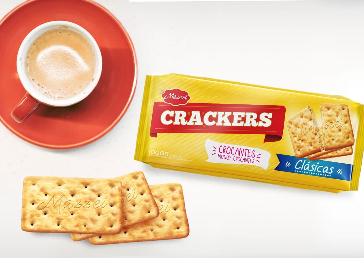
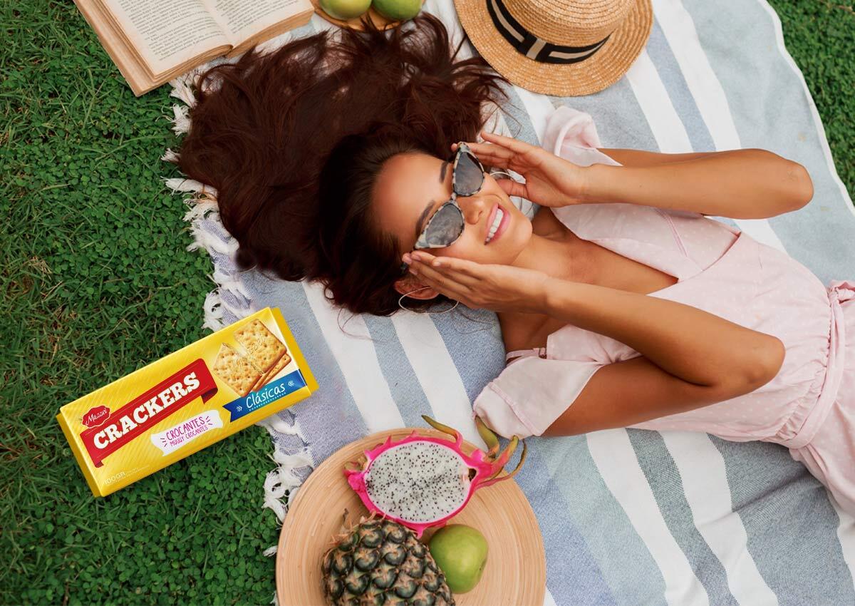
A design for a breakfast classic
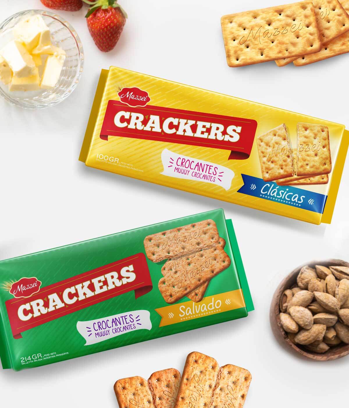
Mazzei called us for the launch of the new Original and Wheat flavor crackers, looking for a packaging design with a relaxed and casual look that manages to integrate as part of the daily breakfast. With characteristic colors of each variety, friendly style fonts and loose style flash, the desired objective was achieved.
Imaginity | Design Agency | Branding, Packaging Design, Marketing
The Challenge
Mazzei Paraguay approached Imaginity design agency to develop the packaging design for their new line of Original and Wheat crackers. The objective was to position these products as an essential part of the daily breakfast routine. The challenge lay in creating a visual identity that felt approachable and everyday, moving away from overly formal structures to capture a more relaxed, morning-oriented consumer occasion.
The Solution
We developed a design strategy focused on warmth and approachability, ensuring the packaging felt right at home on any breakfast table. The creative execution included: Color coding, using a signature color palette for each variety (classic category shades of yellow for Original and green for Bran) to guarantee immediate product identification. We selected friendly and approachable typefaces that convey a relaxed and informal personality, aligning the brand with a modern lifestyle. By incorporating casual touches and a clean composition, we achieved a relaxed visual aesthetic that fits perfectly into the morning routine.

The Results
The final design successfully integrated the new cracker line into the daily breakfast category. By balancing a friendly style with clear variety coding, the packaging design achieved the desired objective: a relaxed yet professional look that resonates with the target audience. The result is a cohesive addition to Mazzei's portfolio, with a fresh and familiar feel that enhances the product's impact at the point of sale.