Client:
Heineken Panamá
Country:
Panamá
Task:
Packaging Design
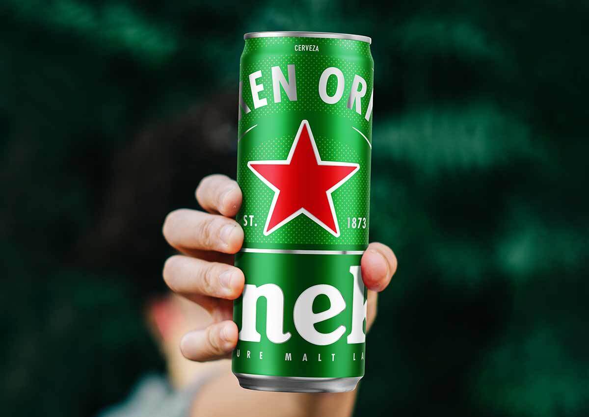
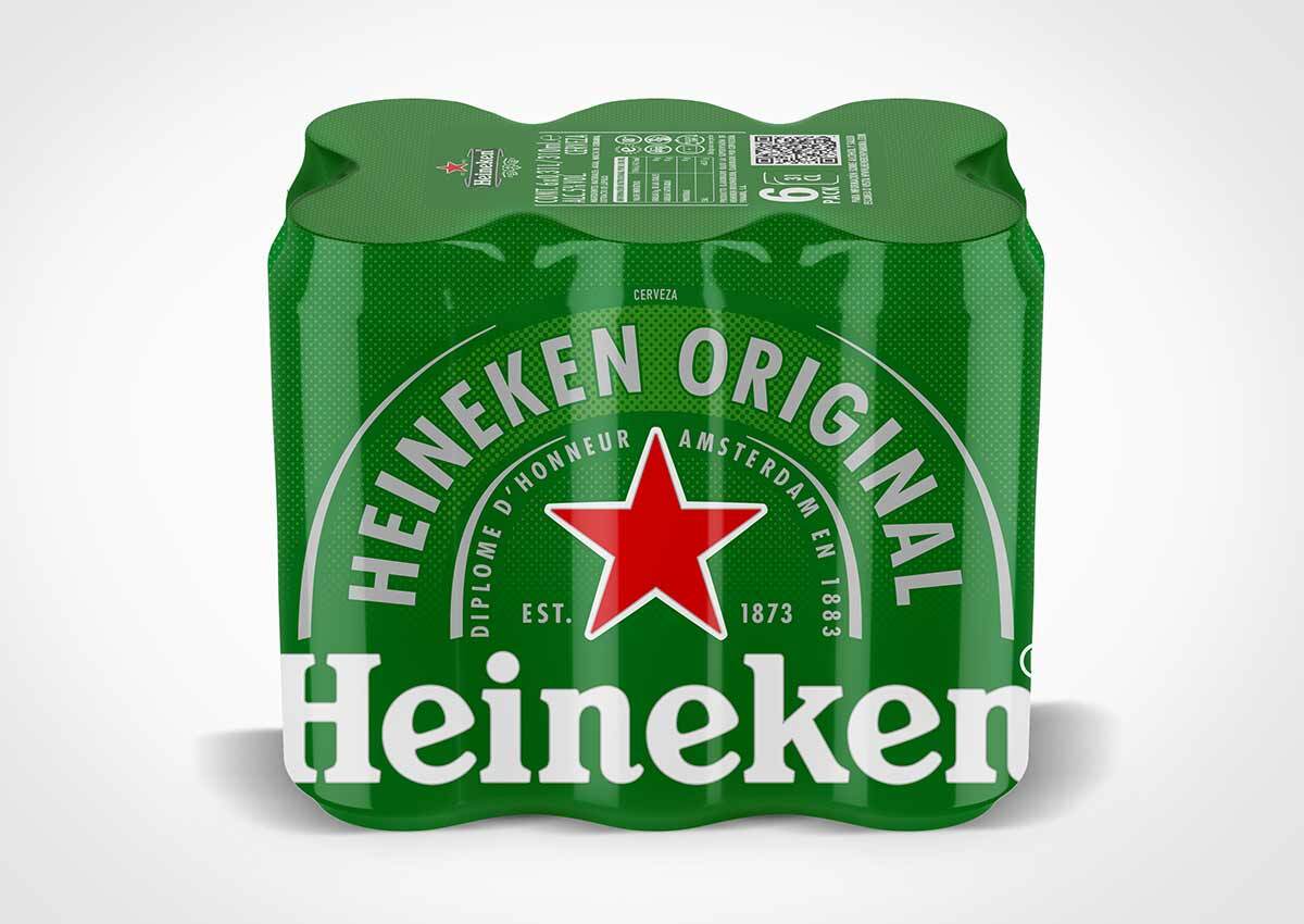
A new can in panama
Heineken Panamá, an international premium beer company, contacted us to develop its cans in the new 310 ml sleek format packaging design, with the premise of ensuring consistency within the line of its packaging design, always rigorously maintaining the application. of the design, to achieve a uniform image on all supports.
Imaginity | Design Agency | Branding, Packaging Design, Marketing

The challenge
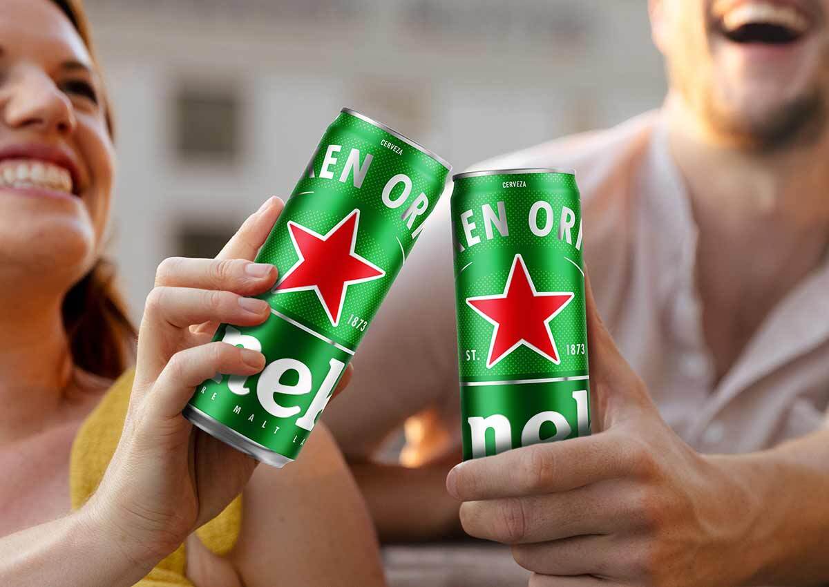
We developed the new beer can format with the premise of creating a strong and cohesive line. The design approach focuses on building a consistent visual system that unifies the range while allowing each product to maintain its own identity.
The solution
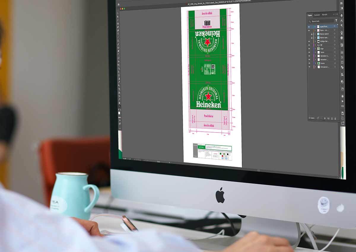
Adapt the design from the other format with the premise of maintaining brand coherence, using balanced compositions, a clear visual hierarchy, and carefully placed graphic elements to create a unified and cohesive brand identity.
Rigorously maintaining the application of the design to ensure the same visual identity across all its touchpoints.
The results
A strong, cohesive, and unified brand across all formats achieved by maintaining a consistent design language and a rigorous application of visual elements. Through balanced compositions, clear hierarchy, and carefully considered details, the brand preserves its identity while adapting seamlessly to different packaging formats and communication platforms.
Imaginity is a global packaging design agency specializing in beverage brands. We help international companies adapt global brand platforms to local markets while maintaining consistency, relevance, and strong in store shelf impact.