Client:
artefacta
Country:
Ecuador
Task:
Branding
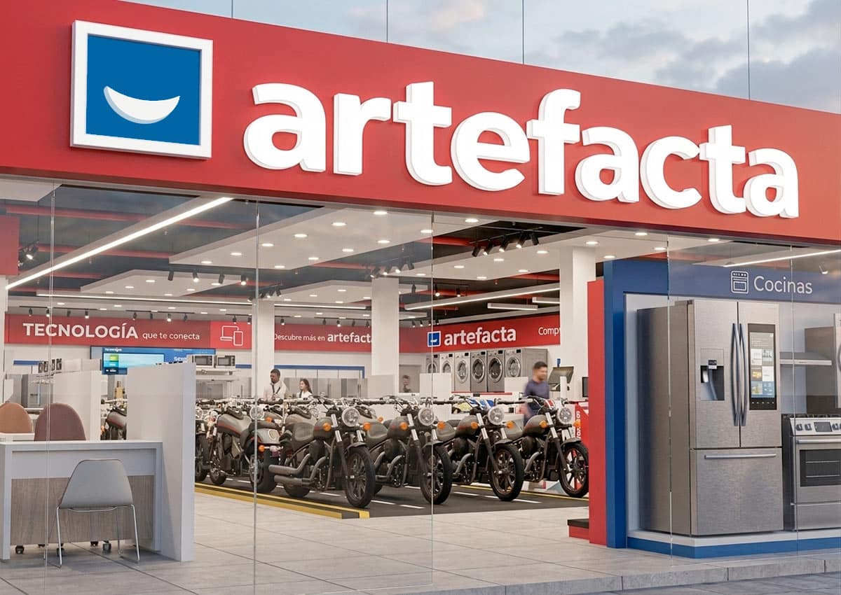
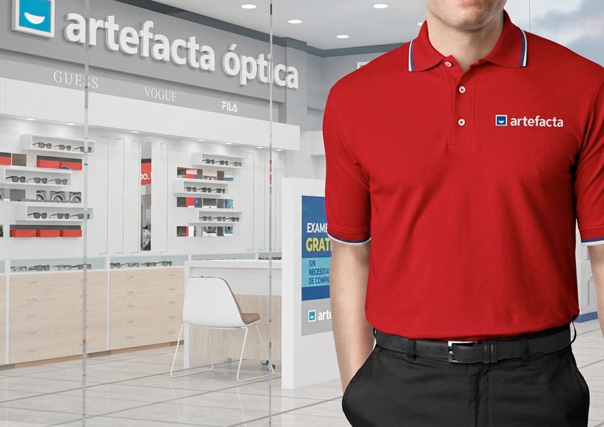
For the rebranding of this leading retail company in Ecuador, we developed an integrated identity that encapsulates its wide-ranging offerings—from home appliances and goods to specialized businesses in motorcycles and optics. Our objective was to create a cohesive Primary Brand that seamlessly unites these diverse categories while enhancing its market presence. This effort aligns with a Brand Architecture Strategy designed to ensure clarity and synergy across all sub-brands. We refreshed the visual identity to reflect modernity and versatility, ensuring that each sector, from household items to eye care, communicated a unified brand message.
Imaginity | Design Agency | Branding, Packaging Design, Marketing

A Smile at the Heart of the Brand
Our challenge, as a leading design agency specializing in branding and logo design, was to develop a future-ready brand identity that would elevate artefacta’s image while preserving the recognition it had built over decades. The result is a new Primary Brand that enhances brand consistency, clarity, and trust across all product and service categories.
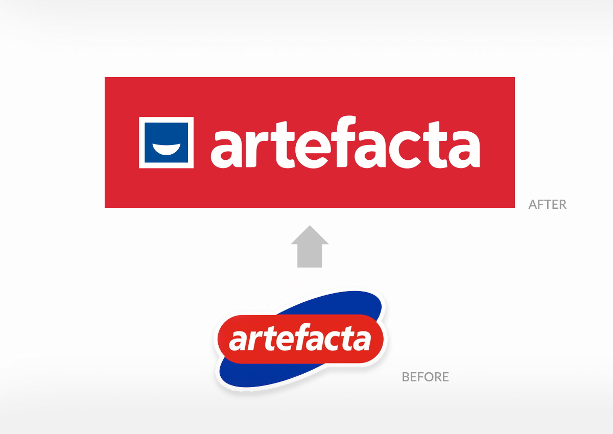
At the center of this transformation was a strategic logo redesign. We incorporated a smile into the new logo to symbolize the happiness Artefacta brings to customers’ lives. This visual element directly supports the new brand motto: “artefacta improves your world,” reinforcing the brand’s mission to enhance everyday life with quality products and service.
A Smile at the Heart of the BrandBrand Evolution with Visual Continuity
To ensure continuity and preserve brand equity, the updated logo maintained artefacta’s iconic color palette—red, blue, and white. These colors, deeply associated with the brand in the minds of Ecuadorian consumers, serve as a visual bridge between the legacy identity and the refreshed look.
By retaining this familiar palette, we reinforced brand recognition and trust, making the transition seamless for existing customers while signaling positive change. The updated color application was refined for a more modern and versatile expression, allowing the new identity to feel contemporary without disconnecting from Artefacta’s long-standing presence in the market.
This thoughtful balance between evolution and consistency is a key part of successful logo design and branding strategy, especially for large, multi-category retail brands. It enables forward movement while safeguarding the emotional connections built over time.


